POW! Signs + Graphics · Slough
Signs out in the world.
Shopfronts, walls and buildings with something to say. Take a look at some of the projects we’ve delivered.
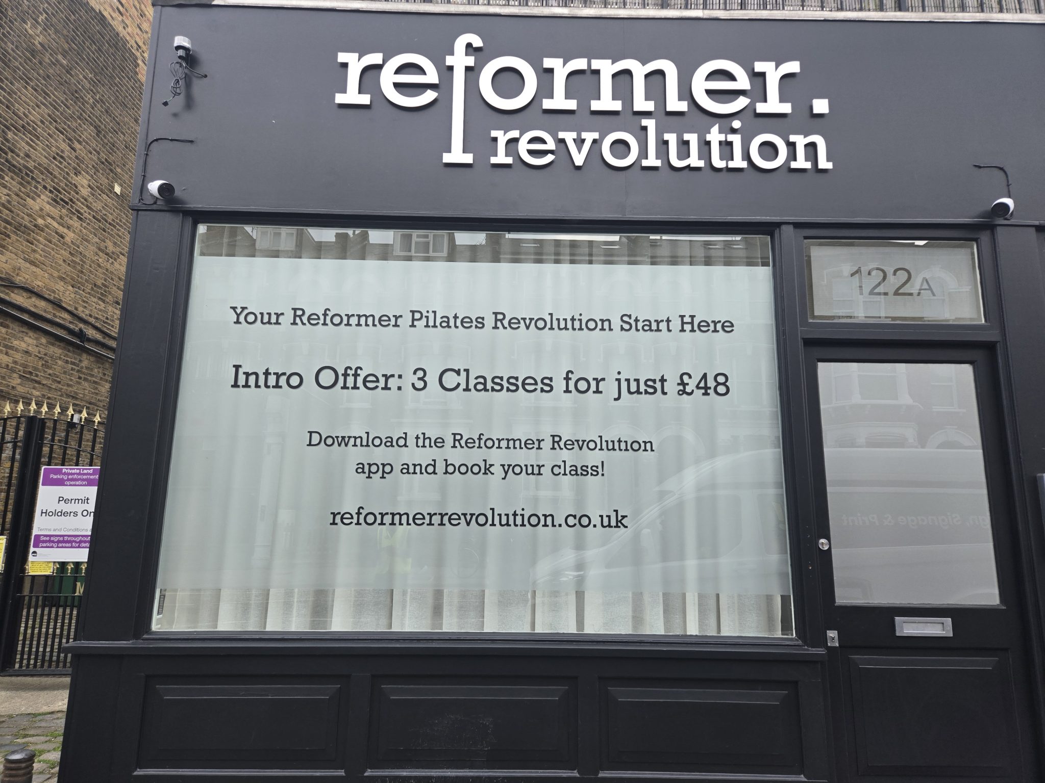
Reformer Revolution
A studio frontage with its own identity. Fascia lettering and frosted window graphics bring the name, privacy and opening offer together.
View case study →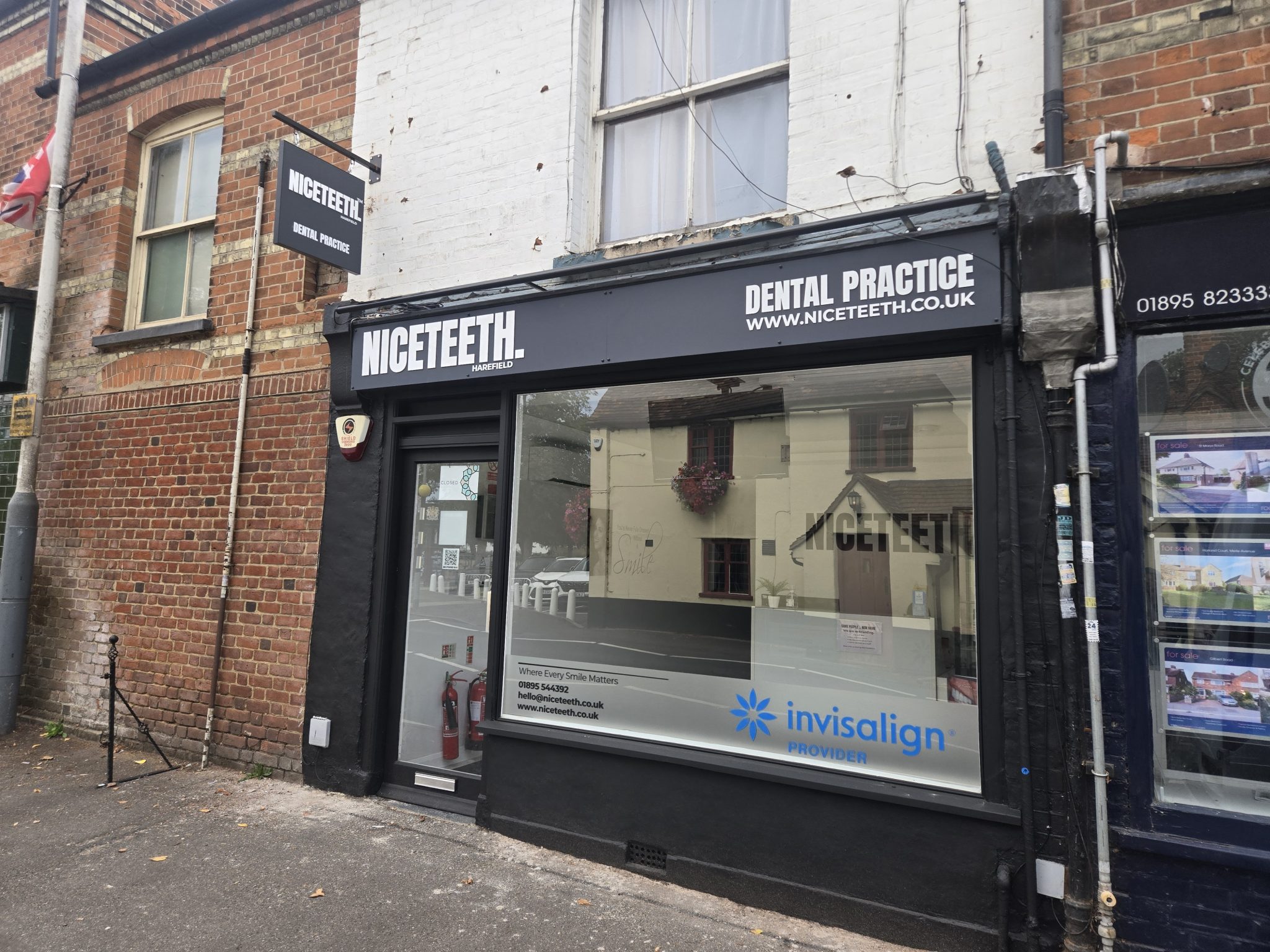
Niceteeth
A clear welcome for patients. White fascia lettering, a projecting sign and window graphics give the practice a coordinated street presence.
View case study →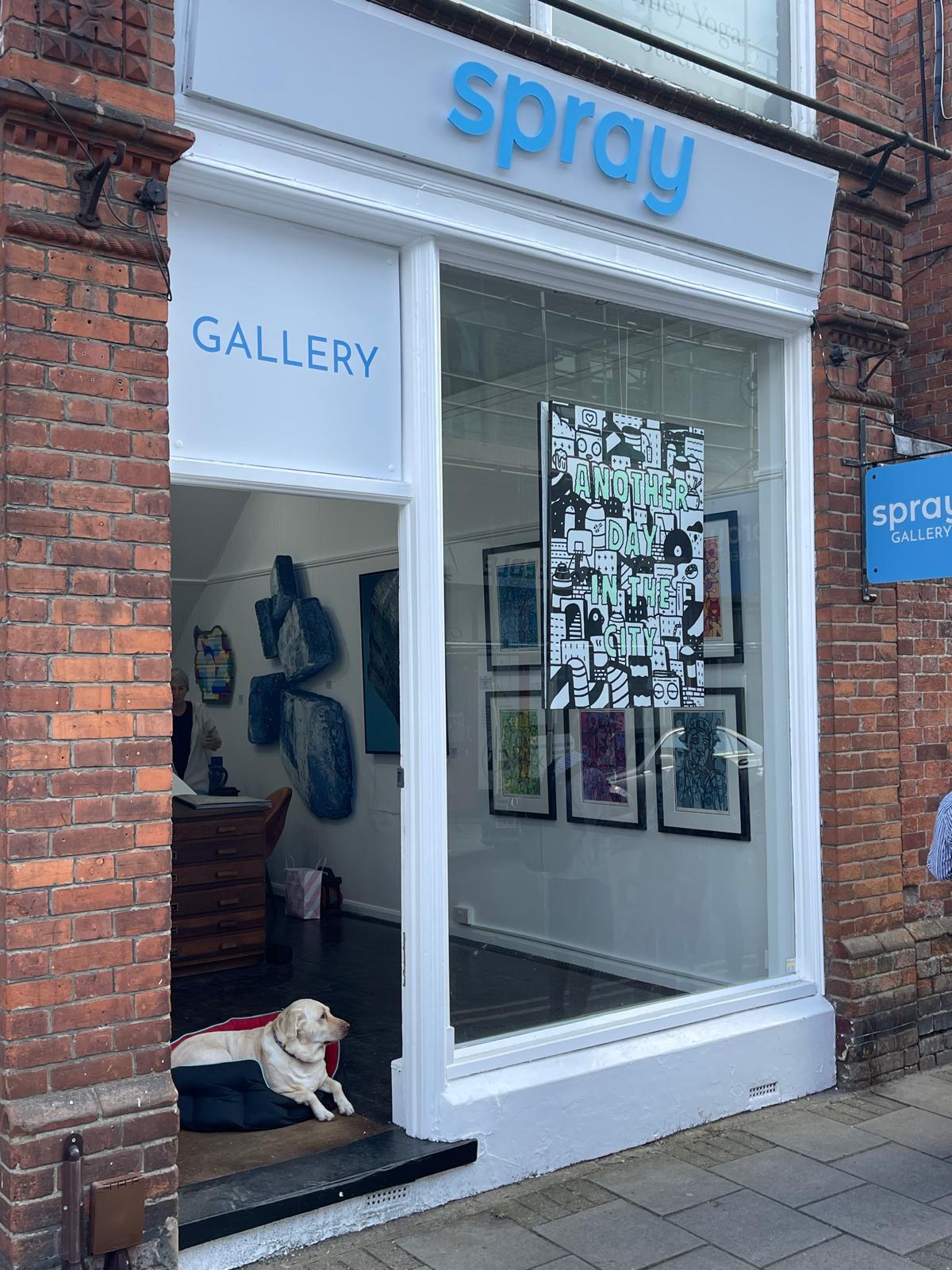
Spray Gallery
Blue lettering and window graphics introduce the gallery before visitors step inside. The projecting sign adds another way to spot it along the street.
View case study →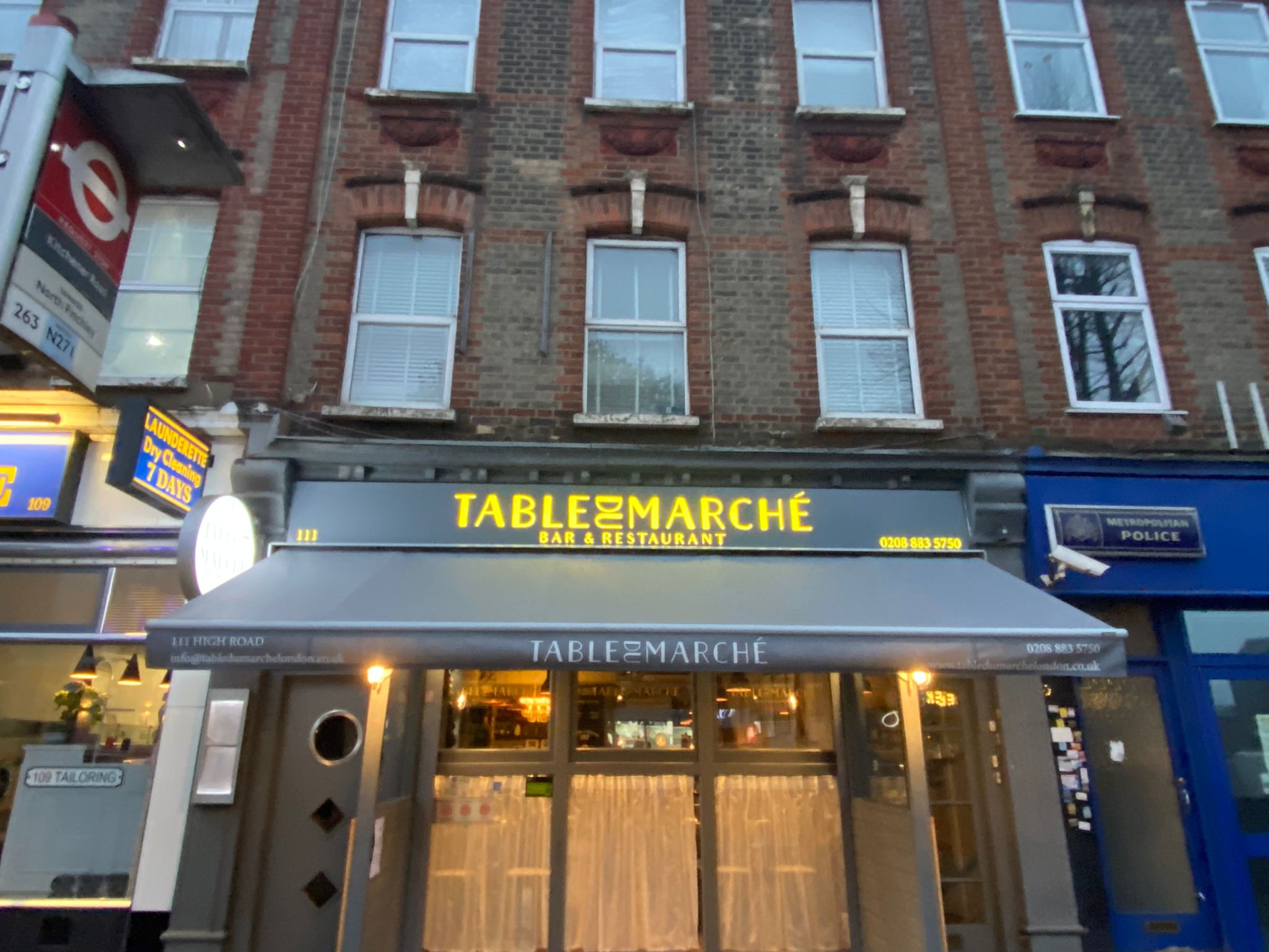
Table du Marché
A frontage that carries into the evening. Illuminated gold lettering gives the restaurant a warm, visible name above the awning.
View case study →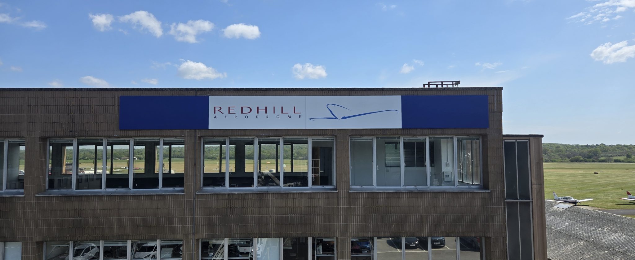
Redhill Aerodrome
An 11-metre sign for a building that needed to be seen. Printed aluminium trays were installed at height, with access and traffic arrangements planned around the working site.
View case study →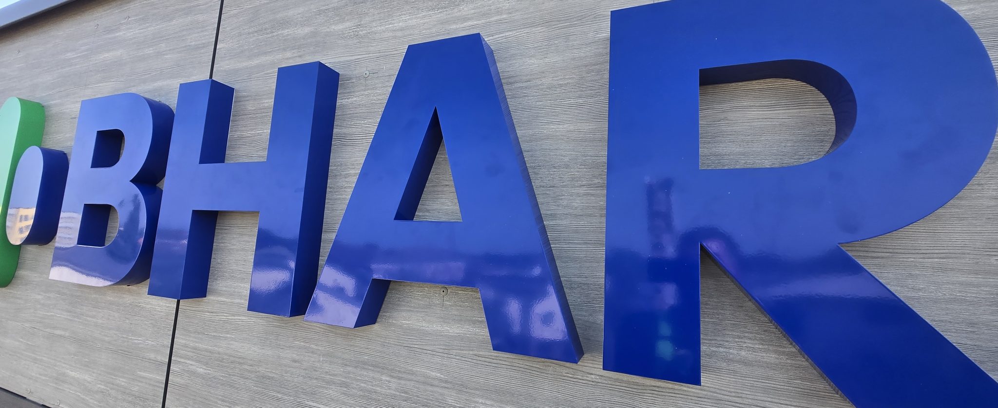
Bharani Health Hub
Three elevations, each with its own viewing distance. Blue and white powder-coated stainless steel letters were sized for the different approaches to the building.
View case study →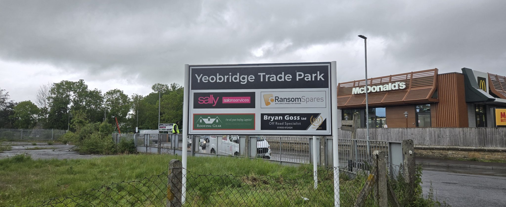
Yeobridge Trade Park
From the entrance directory to individual buildings, around 18 signs bring the estate together. Directions, opening hours and site instructions each have a clear place.
View case study →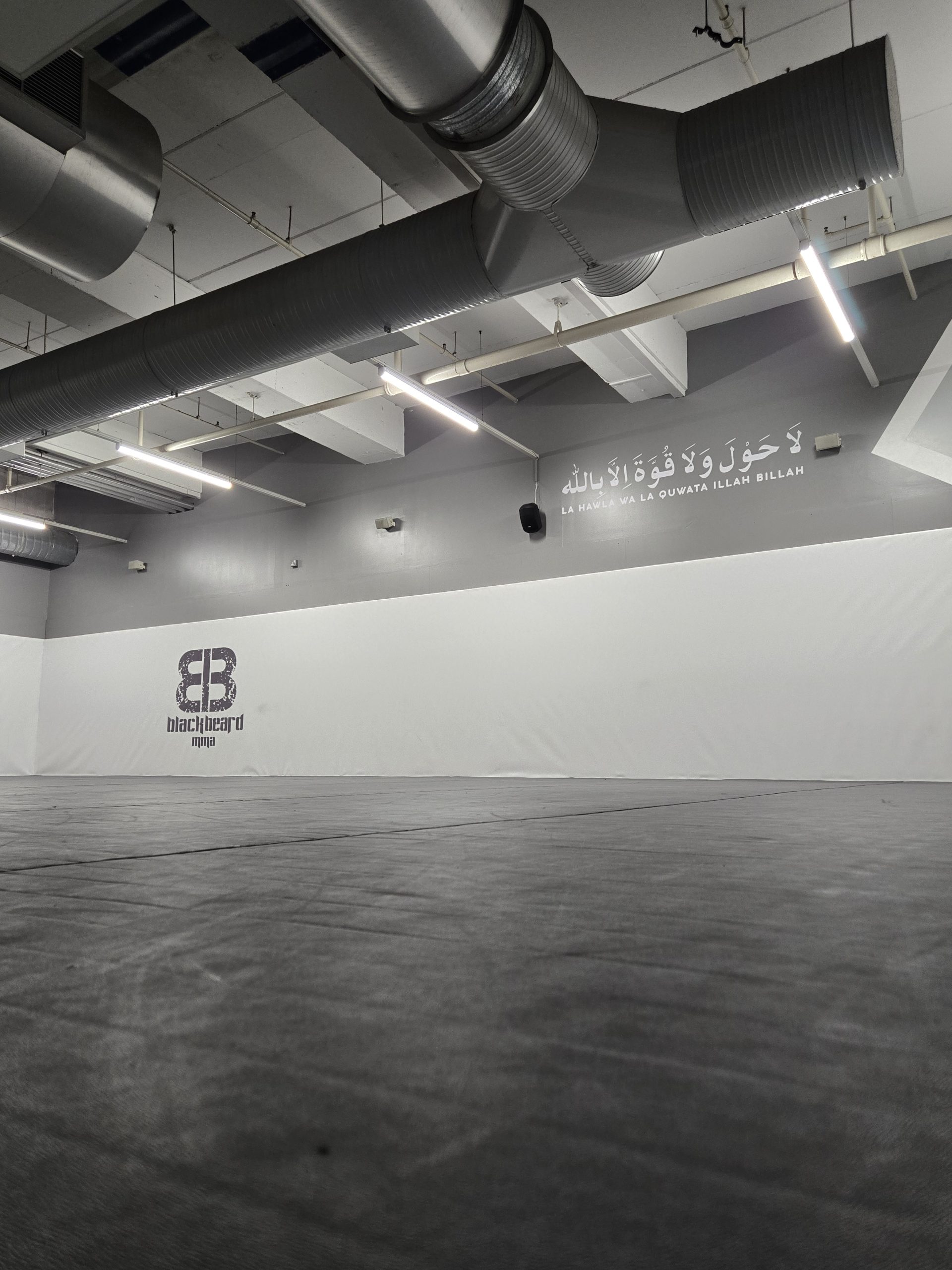
Blackbeard Academy
Bringing the academy’s identity into the room. Large wall graphics give the training space a bold backdrop.
View case study →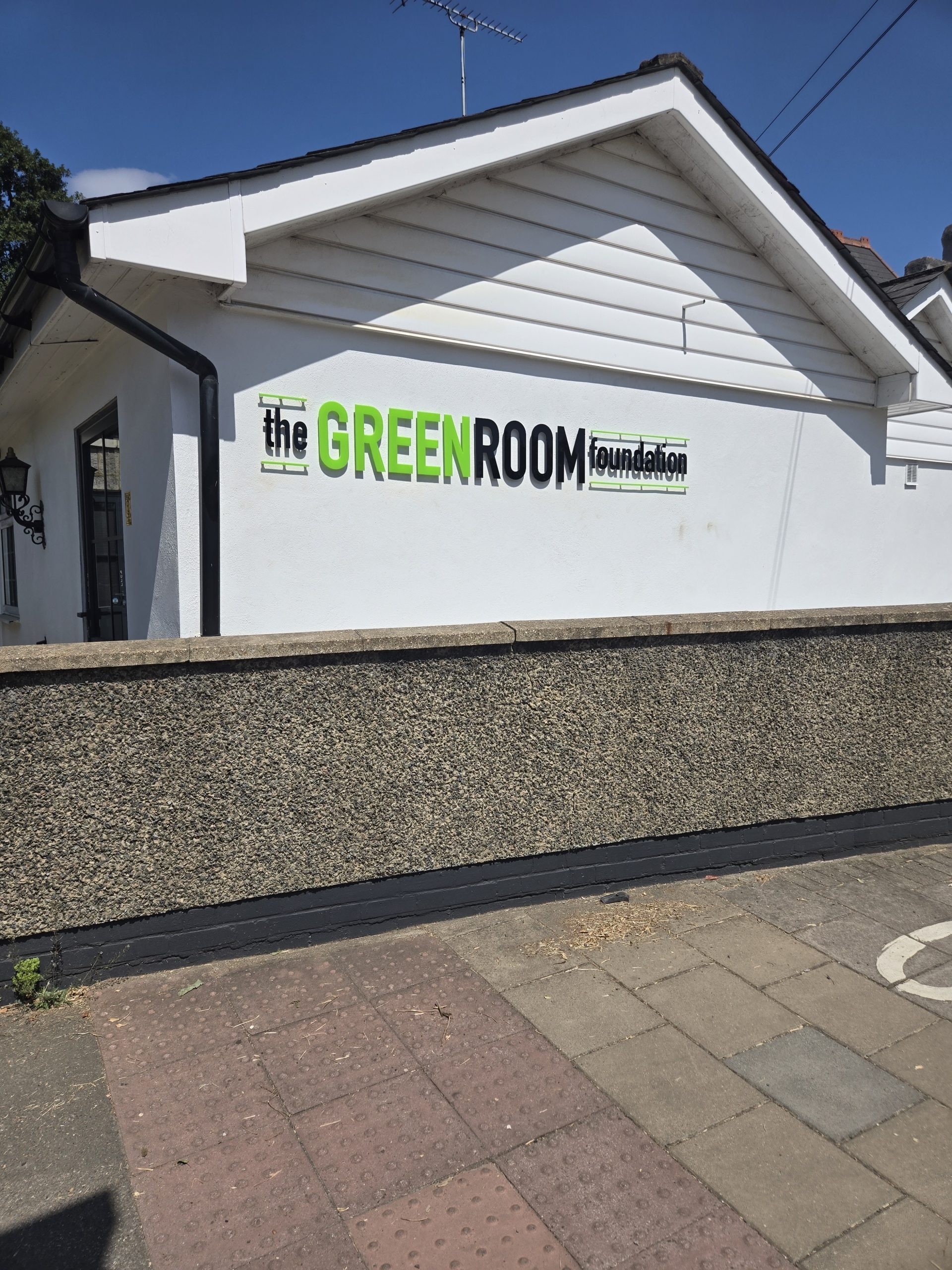
The Green Room Foundation
Acrylic building lettering makes the name easy to spot. Supporting signs cover parking, vehicle movement and arrival information around the site.
View case study →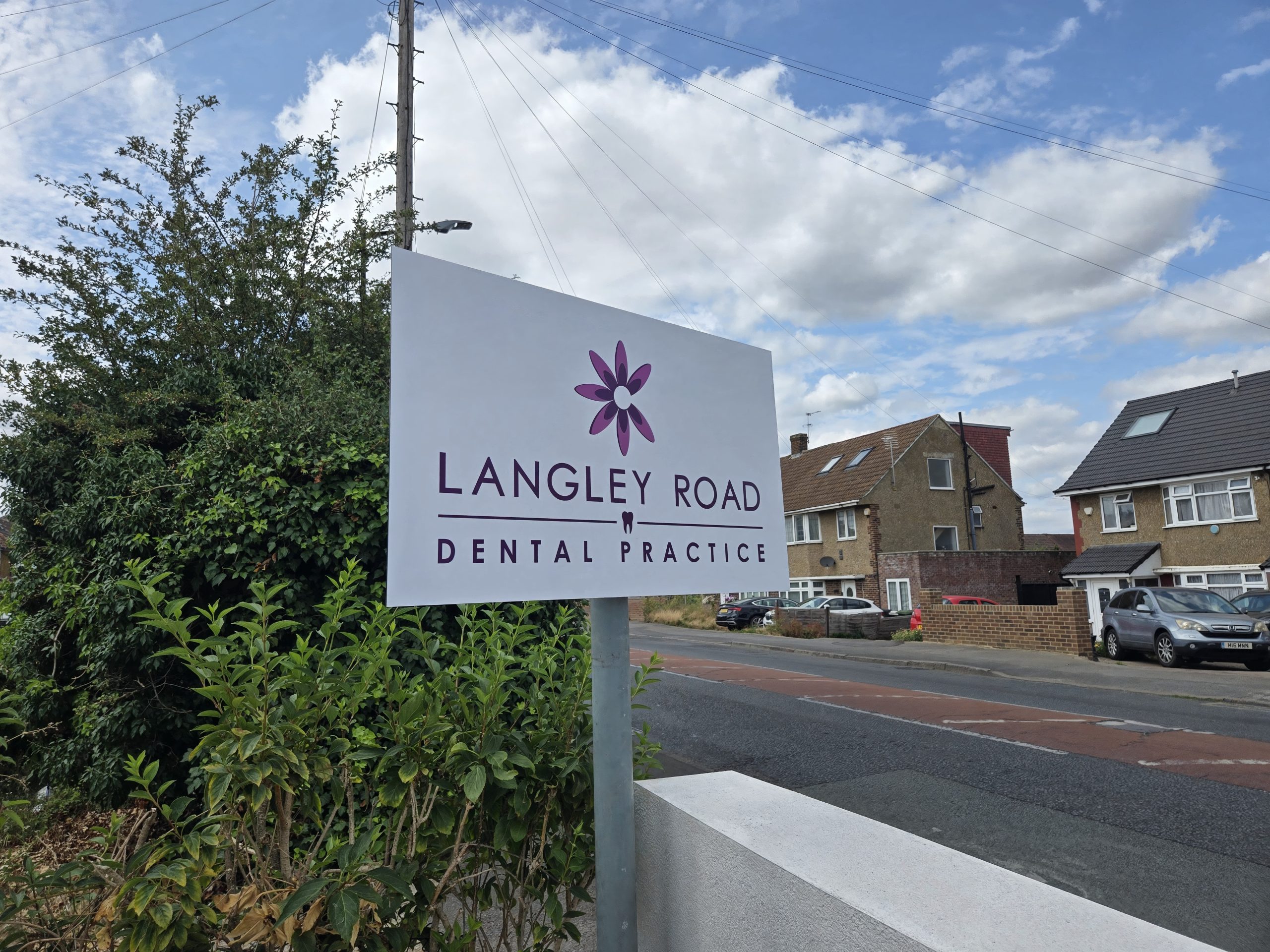
Langley Road Dental Practice
A roadside sign puts the practice name where arriving patients can see it. Positioned beside the entrance, it marks the way in.
View case study →